... in review

Punkt. Aus

This year I got myself a Punkt. MP02 mobile phone. I had been eying the Punkt. for a while as a secondary phone that I could use during periods when when I wanted to avoid the distraction potential that comes with my smartphone — vacations or an evening out at a restaurant or at friends for example. Sometime in 2021 the Punkt. — which is essentially a phone that can do calls, SMS and function as a 4G hotspot — gained the ability to send and receive messages over Signal — which given that I do my messaging over Signal and iMessage — made switching for periods of time feel like a viable option (unlike iMessage which will fall-back to SMS, Signal messages just stay undelivered if the receiving client is not active).

I got the Punkt. on xmas eve and while it is indeed a very nice piece of hardware, that feels nice in the hand I was disappointed almost immediately. Setting up Signal (via an app that is called Pigeon) was extremely cumbersome (mainly because is includes a step where you need to solve an image captcha, that is extremely buggy on the phone’s small screen) and once I had managed to set up Pigeon, the app kept crashing immediately after opening it. The other problem was that by signing into Signal on the Punkt. I was immediately signed out of Signal on my iPhone (which was kind of expected) but also on my laptop (i am a heavy signal user on the laptop and had not considered this).

At the time Punkt. had already announced that a new version of Pigeon would be released on the 27th of December so I boxed up the MP02, went back to the iPhone and waited a few days.

After installing the Pigeon update a few days later, I did manage to get Signal up and running on the phone (while suffering thought the same buggy captcha process again) and could receive and send (with all the drawback that come with suddenly being thrown back to T9 text input) Signal messages on the phone. A few days later we went on vacation to a remote corner of Denmark and I was determined to rely on the Punkt. for that week.

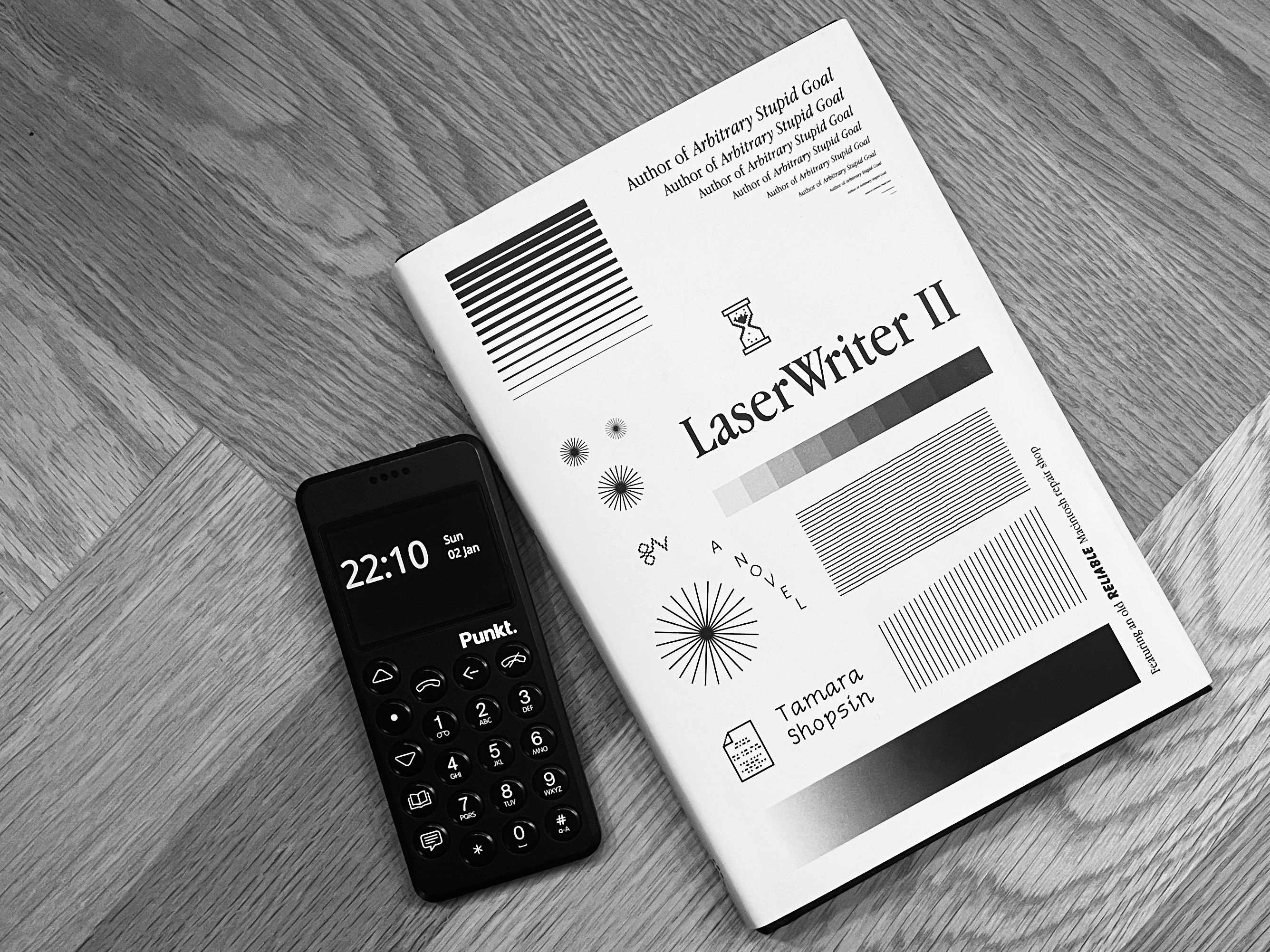
Punkt. MP02 + Laserwriter II on the table of our vacation house

During the week in Denmark week I tried to stay away from the internets and anything work related as much as possible and the Punkt. certainly helped with that. Still other limitations of not using an iPhone became painfully clear almost immediately. While I had bought the Punkt. primarily to avoid distractions and to be less reachable there are in fact lots of functions integrated into modern smartphones that are simply helpful without being distracting.

I had expected that I would miss things like recording my runs on Strava and listening to podcasts while running (both of which work perfectly fine on my non-internet connected iPhone which I took along for my runs) but some other limitations where less expected: the fact that the Punkt. does not support contactless payment (a la Apple Pay) means that I needed to carry a wallet with me for the first time in two or so years. But it was the fact that the Punkt. does have no ability to display an EU Digital COVID Certificate is what ultimately made me swap my SIM-card back into the iPhone and abandon the whole experiment. There was no printer in our vacation house in the remote corner of Denmark but more fundamentally — this being the 21st century — I am simply not willing to go back to carry papers around with me as a trade-off for having less distraction in my life.

Tomorrow UPS guy will come and pick up the phone under Punkt.’s Hassle-free 30 days returns policy and I will be a bit sad that this experiment did not work out. The MP02 is a really nice piece of hardware and I would be happy1 to give it another try if they manage to support Signal in a way that you can run it on multiple devices and switching SIM-cards does not involve silly captcha acrobatics anymore (assuming that by then COVID-19 will be endemic and there is no need to regularly show COVID certificates at random moments of the day).


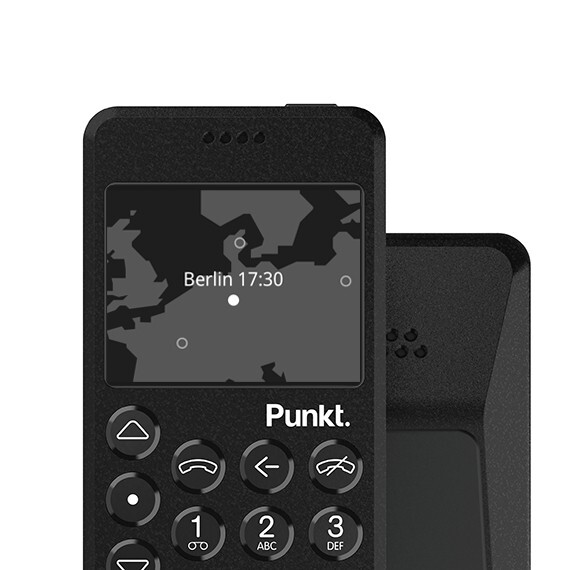
  1. There is one thing that I am really disappointed with: One of the promotional shots of the MP02 on the Punkt. website shows the phone with a map based interface on the screen which I really liked. Turns out that this is simply a mock-up and that this particular interface does not exist for real. ↩︎

CARNE Y ARENA

06 Dec 2017 | 907 words | art exhibition review vr migration mexico united states

In retrospect the whole process of actually getting to experience Alejandro G. Iñárritu’s situated VR installation CARNE Y ARENA at the Fondazione Prada in Milano now looks like a privileged white man’s version of what the protagonists of the installation have gone trough: The almost overwhelming uncertainty if i would ever manage to get there (the result of overwhelmed web servers that could not keep up with the demand for the microscopic amount of tickets available), the realisation that a group only travels as fast as it’s weakest members (an object lesson taught by a group of Filipino women who boarded the flight to Milano with way too much carry on luggage causing the worst boarding mess that i ever experienced) and the ability of those whom you have entrusted with your fate to extract extra compensation (the taxi diver who needed to be bribed into accepting payment by credit card).

While CARNE Y ARENA is primarily described as a possibly genre-defining Virtual Reality experience, the actual VR element (as in the 3D environment projected through the headset) is probably the least interesting bit of it, even though the cinematography is stunning and the choreography of the actions unfolding around you is equally master-full.

Rather it is the use of the supporting sensory triggers that both makes and breaks the illusion created by the VR headset (the whole experience was probably helped by the fact that as a result of my hurried attempts to get there in time i was thirsty for the duration of the experience): The coldness in the holding cell crates a feeling of being out of control that primes you for the desert scene. The cold, rough desert sand and the unidentifiable scent immediately situate you in the desert. As long as you are “alone” in the desert (and later during the helicopter overpasses) the wind machines complete the illusion created by the VR headset.

Once the exhausted migrants appear the illusion starts getting strained. For me this had little to do with the the fact that they were clearly identifiable as rendered characters (as the Verge complains), or even the fact that you could walk into the characters (according the NYT review this seems to be a feature that i did not recognise as such) but rather the fact that i was unable to physically relate to them within the parameters of the simulation. As the group came under attack by the border patrol my urge was to get closer to the other protagonists and to somehow protect or comfort them. But my attempt to hold on to the foot of a frightened child broke the simulation as there was noting to touch and no-one i could comfort.

In the end the very limitations of the simulation amplify the message. Regardless how much i wanted to identify with the the harassed group of migrants, and as much as i experienced the sensory overload of being alone in the dark desert at the mercy of armed men, the limitations of the technology reminded me of my real status as a distant observer. That divergence between your desire to relate, fuelled by the state of the art manipulation of your senses and your inability to completely escape your situated-ness in the real world creates (or at least it created for me) a very profound understanding what it means to be the other (in this case one of the migrants).

Contrary to what i had expected it is not the technical perfection of the installation that constitutes the empathy machine, but the fact that you are reminded that you are indeed only “virtually present” that delivers the message. As confronting as the last scene, where the simulation finally acknowledges your presence and the border patrol officer approaches you shouting and with his assault rifle aimed at you, may be, it was the fact that i could simply leave that brought home the point that for the migrants this option does not exist.

Still, leaving the desert scene left me shell shocked and i spend a long time watching the video testimonials of the migrant protagonists in the decompression room that constitutes the last part of the experience. It is impossible to tell if these were so captivating because of the state i was in or because of the fact that i was alone with them or because of the accomplished videography and performance or because of all of these aspects combined.

In the end the most interesting question is how this way of story telling can ever scale in any meaningful way. The way it is set up in Milano (individual 15 minute slots) the total capacity is somewhere around 5000 visitors in half a year. There are currently 3 instances of CARNE Y ARENA (the other ones are im Mexico City and in Los Angeles) which seems utterly insufficient to reach anyone beyond a very determined part of the global cultural elites, who are likely the ones who are least challenged in their belief systems by the urgent social message encoded in this technological masterpiece. It is not me who needed the exposure to the desperate realities of migrants fighting for their dignity under the conditions of massive global disparities, rather it is someone my above mentioned taxi driver (who was not even aware of the fact that the Prada foundation is a Museum and not the seat of the eponymous luxury goods company).

Summer reading tip: water, knifes, pistachio nuts and the tragedy of the commons

Here is a suggestion for a bit of summer reading: The first thing that you need to read (in order to polish up your knowledge of the water rights issues connected to the Colorado river, a.k.a the law of the river) is this New Yorker article from back in may: Where the River Runs Dry – The Colorado and America’s water crisis by David Owen.

Once you are done with this you need to aquire a copy of Paulo Bacagalupi’s new novel The Water Knife and find yourself a place with a swimming pool full of crystal clear water and amper supplies of bottled spring water (you can of course read this book in any other setting, but it is much more enjoyable that way). If you want to maximize your reading pleasure/guilt even more you should also make sure that you have a bowl of pistachio nuts at hand.

The water knife

So why the swimming pool and the bottled water? That is because The Water Knife is set in a dystopian near future where the lack of water has lead to ecological disaster, civil war like unrest and massive human suffering in American south west. States like Texas have become uninhabitable with their populations fleeing into neighbouring states which try to keep the refugees away while struggling to provide water for their own populations. Against this backdrop powerful water barons fight over water rights that grant them the rights to tap water from the Colorado river to provide water for giant, fully enclosed private real estate projects. The novel follows the story of an enforcer of one of these water barons (a so called ‘water knife’) as he becomes entangled in a mesh of conspiracy and mistrust in the dying city of phonic, Arizona.

For me The Water Knife excels both at creating a credible near term dystopia and as a thriller (i even liked the ending which is a rare thing with thrillers).

To increase your reading pleasure i would suggest that once you are about two thirds through the book (around chapter 39 or so) you take a break and listen to episode 640 of NPRs planet money podcast: The bottom of the well, in which the planet money team examines the economic effects of the current drought in California. As i listened to the podcast i was rather surprised to find out that some of the elements of Bacagalupi’s novel (public relief pumps, water consultants hawking state-of-the-art technology to reach deeper and deeper into dwindling aquifers) are already a reality in parts of California.

The planet money episode makes it painfully obvious how our economic system (a.k.a. capitalism) is set up to create the economic incentives to deplete scarce water resources in drought stricken areas for private gain (this is the moment where you want to reach for a hand full of pistachio nuts) and is possibly the most vivid explanation of the concept of the tragedy of the commons that i have come across to far.

1 plus 8 - the room is a map of the territory

07 Apr 2013 | 300 words | algorithms art exhibition review travel

Yesterday we saw 1+8 at the opulent Galata branch of SALT. 1+8 is a dynamic eight-screen video installation about Turkey and her eight neighbours based on the feature film of the same name directed by Cynthia Madansky and Angelika Brudniak. I usually do not have much patience for video installations but 1+8 managed to capture my attention for quite some time. If you are to believe the catalogue text this thanks to an the brilliance of a ‘custom made algorithmic computer program’ powering the display:

“The installation invites the audience to become immersed in the contemplation of life at the eight borders of Turkey. The multi-screen projection lends itself to experience simultaneity and inter-connection on a physical level. The choreography of video’s on the eight screens, is created dynamically with the help of a custom made algorithmic computer program allowing for a unique viewer experience, whereby the projections will never appear the same way twice.”

Not sure in how far the algorithm contributed to my enjoyment here. Being a bit obsessed about maps i was much more delighted by the way the room (a large rectangle) was used as a map of the territory, with the videos projected on those parts of the wall that correspond with the actual borders between Turkey and its eight1 neighbours (this of course only works with a country like turkey which is an even bigger rectangle):

turkey in a box

Also, it appears that the border regions between Turkey and its six Asian neighbours are really fascinating/beautifull which makes me want to travel there at some point in the future


  1. One of the things learned here is that the Turkish consider the Autonomus Repubic of Nakhchivan a neghbouring country (which – it should be noted – has the tiniest possible border with Turkey). ↩︎ ↩︎

The market's clock speed is laughable

Just finished reading ‘Red Plenty‘ by Francis Spufford which has replaced ‘Turing’s Cathedral‘ as my favourite book from this year. In fact the two books probably should be read together. Red Plenty picks up approximately where Turing’s Cathedral ends and offers a rather fascinating peek into how the invention of electronic computers interacted with the planned economy of the Soviet Union under Khrushchev and his immediate successors.

Red plenty follows a community of scientists (economists, computer scientists, cycberneticans and biologists) who propose to reform planning of the soviet economy along the principles of linear programming. The ultimate goal of this exercise is to accelerate economic growth and to bring into being a state wherein there are sufficient amounts of commodities available for to satisfy the needs (and desires) of every citizen (a.k.a communism). This provides fascinating insights into the functioning of the planned economy and the soviet bureaucracy as well as the hopes and fears of those involved.

One of the reasons why this is such a good book is that it really forces you to acknowledge that there a legitimate reasons to question the capitalism and the market as the only viable and sane economic arrangement. While it is clear that the particular approach that is portrayed in Red Plenty has failed with disastrous consequences reading the book reinstalls the notion that another world should be possible.

As Jo Walton notes in his review Red Plenty is at its best where it describes specific problems that appear as a result of economic planning. One example is the following account about running an algorithm that optimises potato delivery to Moscow on an early Soviet mainframe computer. I particularly enjoyed reading this in the light of recent debates about algorithmic trading. Compared to the current practice of trading for the sake of trading this account of crude algorithmic non-market optimisation actually makes sense.

The BESM. A picture of what? Of potatoes. The electrons flowing through the vacuum tubes represent digits; and tonight the digits the BESM is processing represent potatoes. Not, of course, potatoes as they are in themselves, the actual tubers, so often frost-damaged or green with age or warty with sprouting tubercles – but potatoes abstracted, potatoes considered as information, travelling into Moscow from 348 delivering units to 215 consuming organisations. The BESM is applying Leonid Vitalevich‘s mathematics to the task of optimising potato delivery for the Moscow Regional Planning Agency. Seventy-five thousand different variables are involved, subject to 563 different constrains: this problem is out of reach of fingers and slide rules. But thanks to computers, thanks to the BESMs inhuman patience at iterating approximate answers over and over again, it is a problem that can be solved.

The BESM is using Leonid Vitalevich’s shadow prices to do what a market in potatoes would do in a capitalist country – only better. When a market is matching supply with demand, it is the actual movement of the potatoes themselves from place to place, the actual sale of the potatoes at ever-shifting prices, which negotiates a solution, by trial and error. In the computer, the effect of a possible solution can be assessed without the wasteful real-world to-ing and fro-ing; and because the computer works at the speed of flying electrons, rather than the speed of a trundling vegetable truck, it can explore the whole of the mathematical space of possible solutions, and be sure to find the very best solution there is, instead of settling for the good-enough solution that would be all there was time for, in a working day with potatoes to deliver. You don’t, in fact, have to look as far away as the capitalist countries to find a market for purposes of comparison. There is still a market in potatoes, right here in Moscow: the leftover scrap of capitalism represented by the capital’s collective-farm bazaars, where individual kolkhoznik’s sell the produce from their private plots. Somehow, in the hardest times, there are always piles of green leeks here, and fat geese, and mushrooms smelling damply of the forest, and potatoes dug that morning; all so expensive you’d only shop here if money was no object, to stock up for a birthday or a wedding party. When the trade is briskest, the recording clerks sally out from the Ministry of Trade’s little booths and walk among the stalls, carefully writing down prices. But how slow it is! How slowly things move, as customers jostle in these triangles of waste ground next to the city’s bus stations and train stations, compared to the ten thousand operations per second of the BESM!

The markets clock speed is laughable. It computes at the rate of a babushka in a headscarf, laboriously breaking a two-rouble note for change and muttering the numbers under her breath. Its stock arrives one sack or basket at a time, clutched on a peasant lap. It calculates its prices on cardboard, with a stub of pencil. No wonder that Oskar Lange over in Warsaw gleefully calls the marketplace a ‘primitive pre-electronic calculator’. In the age of the vacuum tube, its an anachronism, good only for adding a small extra source of high-priced supply to the system, for those moments when the modern channels of distribution can’t quite satisfy every consumer need. And now even that function is becoming obsolete. When Leonid Vitalevich’s program reorganises Moscow’s delivery system, the efficiency gains should fill the state shops with enough cheap potatoes for everyone. Now, as the seconds pass, the BESM is steadily shaving away the average potato delivery distance in the capital. At present, it seems, a spud must travel an average of 68.7 kilometres from cold-store to shop: but in the basement of the Institute of Precise Mechanics it is already clear that 61.3 kilometres is possible, 60.08 kilometres, 59.6 kilometres, and still the program is showing that the optimum has not yet been reached. The shorter the distance, the fresher the potato, the smaller the spoilage this is the best index of success the programmers can come up with, since price as such is not available to them as a quantity to be minimised. The state selling price of potatoes has been fixed for many years. 57.9 km, 56.88 km. This is very nearly a 20% improvement. Soon Moscow’s potato supply will be 20% better. 55.9 km, 54.6 km. Its a new world. (page 115f)

Also – and somewhat predictably – reading red plenty has added a new place i want to visit to my growing list of such places: the beach in Akademgorodok (at the bottom-left of this picture)

Crop from a photo by Elya via wikimedia commons

The future of copyright will most likely not be determined by a cost benefit analysis

29 Jul 2012 | 238 words | copyright economics economy future review war books

So i finally managed to start reading the ‘Future of Copyright‘ anthology that contains the winning essays from a contest organised by the Modern Poland Foundation. So far (i have not read them all) my favourite essay is ‘Give‘ by Togi, which i read as powerful argument that systemic change (and not just reform) is not only much needed but also possible. While his overall line of argument is pretty convincing (to me), i have a bit of trouble following one of his (her?) central arguments (Mike Linksvayer makes a very similar point in his review of the anthology):

3.1.1.0.2

At the point where government profit from copyright/IP is negated by the cost of its enforcement (both in monetary terms and in terms of public goodwill), free culture will be permitted.

While this would be the logical thing for governments to do, there is ample evidence that governments don’t work like this. This seems to be especially true in conflicts that are rhetorically packaged as ‘wars’. The ‘war on drugs’ is the best example of this (if this does not make sense to you listen to the last point bought forward in this episode of the planet money podcast), but it is also true for the ‘war on terror’. Given this i think it is rather naive to expect (as Togi does) governments to succumb to rational economic thinking when it comes to the war on piracy sharing.

Seeing with more precision than a state

27 May 2012 | 299 words | facebook politics review books

So i am finally finding the time to read James C. Scott’s Seeing Like a State: How Certain Schemes to Improve the Human Condition Have Failed. At the end of chapter 2 he makes the observation that…

…the modern state, through it’s officials, attempts with varying success to create a terrain and a population with precisely those standardized characteristics that will be easiest to monitor, count, asses, and manage. The utopian, immanent, and courteously frustrated goal of the modern state is to is to reduce the chaotic, disorderly, constantly changing social reality beneath it to something more closely resembling the administrative grid of it’s observations.

This observation, which is essential in understanding how governments work, is even more interesting when seen in the context of large non-state entities like facebook. It clearly illustrates why the recurring attempts to compare facebook to a nation state (most recently in this otherwise rather informative Verge article on facebook’s security).

Seen in the light of Scott’s observation facebook is a quantum leap ahead of the modern state: Facebook does not need simplified abstractions to make sense of the social reality of it’s members as it had direct and unmediated access to this social reality (if you want to understand how granular Facebook’s analytical grid is, this Planet Money episode is a good start).

In the end this is what makes Facebook dangerous: it may very well be that this direct access to the social reality of it’s members does not justify it’s inflated IPO price, but with increasing pressure to monetize the social reality of it’s members, Facebook will sooner or later realize that governments are probably willing to pay for access in order to once and for all achieve their utopian, immanent, and courteously frustrated goal of total information about their populations.

Money & Speed - show me the data...

Two weeks ago the 50 minute documentary ‘Money & Speed‘ by Marije Meerman aired in the tegenlicht (backlight) series of the VPRO (a dutch public broadcaster). ‘Money & Speed’ casts a light into the world of high frequency (or rather algorithmic) trading, a subject that i have been fascinated with for a while. The documentary attempts to explain the event’s behind the 6 may 2010 ‘flash crash‘ and does so by interviewing a number of experts that are more or less involved in the (aftermath of) the crash.

money & speed title screen

While ‘Money & Speed’ stops short of pointing out who (or what) was responsible for the events on may 6th 2010 (there are conflicting theories and tegenlicht’s prime source Eric Hundsader of Nanex clearly has been advised not to mention on camera whoever he thinks caused the events) it is quite a remarkable documentary that gives an fascinating insight into a world that is most likely completely unknown to more the 95% of the television audience.

I also really like how Meerman has woven George Dyson and his theories about differences in time perception between humans and computers into the narrative of the documentary. That guy certainly makes more sense than Kevin Kelly.

What makes ‘Money & Speed’ even more interesting is that next to the broadcast version the VPRO (together with catalogtree) has released an iPad version of the documentary in the form of a free iPad app1 that contains the entire film in high quality as well as a number of supporting assets such as infographics, short bio’s and a glossary of terms used in in the documentary.

At the first glance (and certainly for a first attempt) the app version of ‘Money & Speed’ seems to be crafted really well. The app is really responsive which makes pulling up extra information while watching a pleasure. You simply click on one of the thumbnails in the top right corner and the video stops instantly and resumes instantly after you are finished reading the text-box.

money & speed

The absence of noticeable delay makes this process work very well (it does not feel as an interruption of the flow at all even though the video itself stops). In the case of a couple of the bigger infographics there is an annoying delay before the infographics appear, but the transition back to the video is almost instantaneous.

Unfortunately those big info graphics (tick for tick visualizations of three different stocks, a visualization of the fall of the dow jones index, a map showing possible locations for financial data processing centers in the vicinity of New York City, and a delayed real-time stock market data map) are not really connected to the storyline of the documentary.

These are clearly the most labor intensive parts of the ipad app, but they do not add to the understanding of the events described: The delayed real-time stock market data map is a complete waste of resources (although it has a vey nice darkish background noise that i am listening to right now) and the map of the data centers, while visually striking does not even show the locations of the data-centers that are depicted in the documentary. The tick for tick visualizations (visible on the ipad in the screenshot above) while impressive simply fail to convey much information (Alpher suggests that this is because ‘the information density is low’).

Given these shortcomings one might come to the conclusion that adding extra visualizations to a documentary like Money & Speed provides little extra value to the viewer. I am pretty sure that this is the wrong conclusion and that the real problem at hand is that the creators of ‘Money & Speed’ have simply selected the wrong data to visualize2:

money & speed

Towards the end of ‘Money & Speed’ Meerman juxtaposes two different views on what happened on the the 6th of May. That of the official SEC & CFTC report and that of independent data analysis done a by the Chicago based financial data services firm Nanex. Both identify different triggers for the flash crash and their disagreement seems to come from the granularity of time applied to their analysis. While the SEC & CFTC report works with seconds Nanex claims to be able to identify events on the nanosecond level that are averaged out (an thus invisible in the SEC & CFTC report) when looking at the events with less granularity. During this part of the movie Eric Hundsader is shown pointing at this data on one of his computer screens and if you ask me it is this crucial data-set that should have been included in the iPad app instead of the tick for tick visualizations:

money & speed

Still the ‘Money & Speed’ iPad app (the VPRO calls this format a ‘touchdoc’) shows a lot of promise. i can imagine that once the technology for integrating linear video content with additional assets like data visualizations becomes more common, attention will shift towards editorial concepts that better integrates the extra assets with the main narration. In an ideal case scenario that would mean that the underlying research assets of the creators are available to consumers both as extra information but also in order to independently verify claims made by the documentary makers. Given this ‘Money & Speed’ tastes like one possible future of investigative documentary film making.


  1. At the time of writing the app is only available in dutch and only in the dutch app store. the VPRO is working on an english language version that will be available in other app-stores for a fee. It is free in the Netherlands because for regulatory reasons the VPRO cannot charge the public for content it has produced with public broadcasting money. This is not the case outside of the Netherlands and it will be very interesting to see how much income ‘Money & Speed’ will generate outside of the Netherlands. I could very well imagine that a documentary-app (is that an existing category?) of this quality could easily generate income that exceeds the production costs (of the app, not the entire project). ↩︎

  2. Of course this might not have been entirely voluntary. It is possible that this is the only data that they were authorized to include or that they had to make choices which data to visualize really early in the project and as a result could not react anymore once the more interesting datasets appeared. ↩︎

Restrepo

31 Dec 2010 | 224 words | afghanistan documentary review war movies film

Just finished watching the award winning war documentary restrepo. hard not to be impressed with this documentary (gives a whole new meaning to embedded journalism) and hard not to feel empathy with the soldiers who served more than a year at the end of the world (or as they themselves refer to it, ‘the valley of death’)

Village elders and solider at shura

Aside from the firefights and the portraits of the (extremely young) soldiers restrepo perfectly illustrates the futility of the US-led war in Afghanistan. the whole film shows that that there is absolutely no reason why the US should be in Afghanistan in the first place, their presence there simply makes no sense at all. It appears that the heavily armed twenty-somethings and the red-bearded, toothless village elders inhabit parallel universes. unfortunately for the red bearded, toothless village elders they are getting shot at (and their cows get killed) from the other universe, without there being any meaningful means of recourse for them.

Fortunately for the village elders the US retreated from the Korengal Valley in april 2010. If restrepo serves as an indicator the US would be wise to retreat from the rest of the country as well (before they are forced to do so)

p.s. this picture pretty much makes the same point:

Donkey collapsed under weight of election materials

Required reading? de schijn-élite van de valse munters

Two days ago i finished reading ‘De Schijn-élite van de Valse Munters‘ the much-hyped book by Martin Bosma who is credited with being the strategic brain behind the rise of the populist/islamophobic PVV that is enabling the current right wing minority government in the Netherlands.

I am not exactly sure why i started reading this book in the first place, but i guess it was because i wanted to get a better understanding some of the reasoning behind the (often extreme and seemingly irrational) politics of the PVV. I had also hoped that the book would contain some level of analysis of socio-economic issues that could contribute to my understanding the unprecedented electoral success of the PVV and learn from that. In short, i think that i had hoped that Bosma would turn out to be a really smart strategic thinker from whom i could learn a thing or two. unfortunately, the book has been a huge disappointment in all of these regards.

To be fair, i do not think that Bosma intended to analyze the current status of Dutch society or provide insights into his (or the PVV’s) strategic thinking. For him the books seems to serve one single purpose: to discredit his political opponents on the left.

In essence the entire book consists of an endless collage of quotes from various sources (his favorite sources are post WWII social democrats and fringe lunatics whom he refers to as ‘islam-experts’). From these quotes he tries to weave together a narrative that is supposed to show that following the 1960s Dutch society has been taken over by a far-left elite whose primary concern is to surrender the Netherlands to hordes of muslim immigrants who’s prime concern is to establish sharia law/a caliphate.

To ‘prove’ his theory he relies heavily on his impressive collection of quotes but presents almost no empirical evidence other than a number of references to surveys that have found that ‘the dutch people’ do not desire immigration or any other of the policies of the elites such as subsidies for the arts.

As a result, the biggest part of his book is devoted to a rather absurd attempt to frame the current elites as far-left extremists. This culminates in an entire chapter that is devoted to explaining that Adolf Hitler was, in fact, a far-left extremist1. While Bosma’s almost physical rejection of what he identifies as far-left extremist politics is palpable, i am still a bit puzzled what he wants to prove here: defining his own political position primarily in opposition to (a grotesquely twisted description of) the positions of your opponents does not strike me as something you would do if you had a well developed understanding of your own position.

All of this does not make Bosma the most stupid member of parliament ever (dutch, google translation here), but after reading through his book i am relatively certain that i overestimated his intelligence and the analytic rigor quite a bit. Now this is almost certainly a good thing…


  1. If you read Dutch i recommend reading Ed van Thijn’s response (pdf) in the most recent issue of Socialisme and Democracie in which he strongly objects to Bosma’s attempt to equate socialism and national socialism. ↩︎

meanwhile... is the personal weblog of Paul Keller. I am currently policy director at Open Future and President of the COMMUNIA Association for the Public Domain. This weblog is largely inactive but contains an archive of posts (mixing both work and personal) going back to 2005.

I also maintain a collection of cards from African mediums (which is the reason for the domain name), a collection of photos on flickr and a website collecting my professional writings and appearances.

Other things that i have made online: