Money & Speed - show me the data...
Two weeks ago the 50 minute documentary ‘Money & Speed‘ by Marije Meerman aired in the tegenlicht (backlight) series of the VPRO (a dutch public broadcaster). ‘Money & Speed’ casts a light into the world of high frequency (or rather algorithmic) trading, a subject that i have been fascinated with for a while. The documentary attempts to explain the event’s behind the 6 may 2010 ‘flash crash‘ and does so by interviewing a number of experts that are more or less involved in the (aftermath of) the crash.
money & speed title screen
While ‘Money & Speed’ stops short of pointing out who (or what) was responsible for the events on may 6th 2010 (there are conflicting theories and tegenlicht’s prime source Eric Hundsader of Nanex clearly has been advised not to mention on camera whoever he thinks caused the events) it is quite a remarkable documentary that gives an fascinating insight into a world that is most likely completely unknown to more the 95% of the television audience.
I also really like how Meerman has woven George Dyson and his theories about differences in time perception between humans and computers into the narrative of the documentary. That guy certainly makes more sense than Kevin Kelly.
What makes ‘Money & Speed’ even more interesting is that next to the broadcast version the VPRO (together with catalogtree) has released an iPad version of the documentary in the form of a free iPad app1 that contains the entire film in high quality as well as a number of supporting assets such as infographics, short bio’s and a glossary of terms used in in the documentary.
At the first glance (and certainly for a first attempt) the app version of ‘Money & Speed’ seems to be crafted really well. The app is really responsive which makes pulling up extra information while watching a pleasure. You simply click on one of the thumbnails in the top right corner and the video stops instantly and resumes instantly after you are finished reading the text-box.
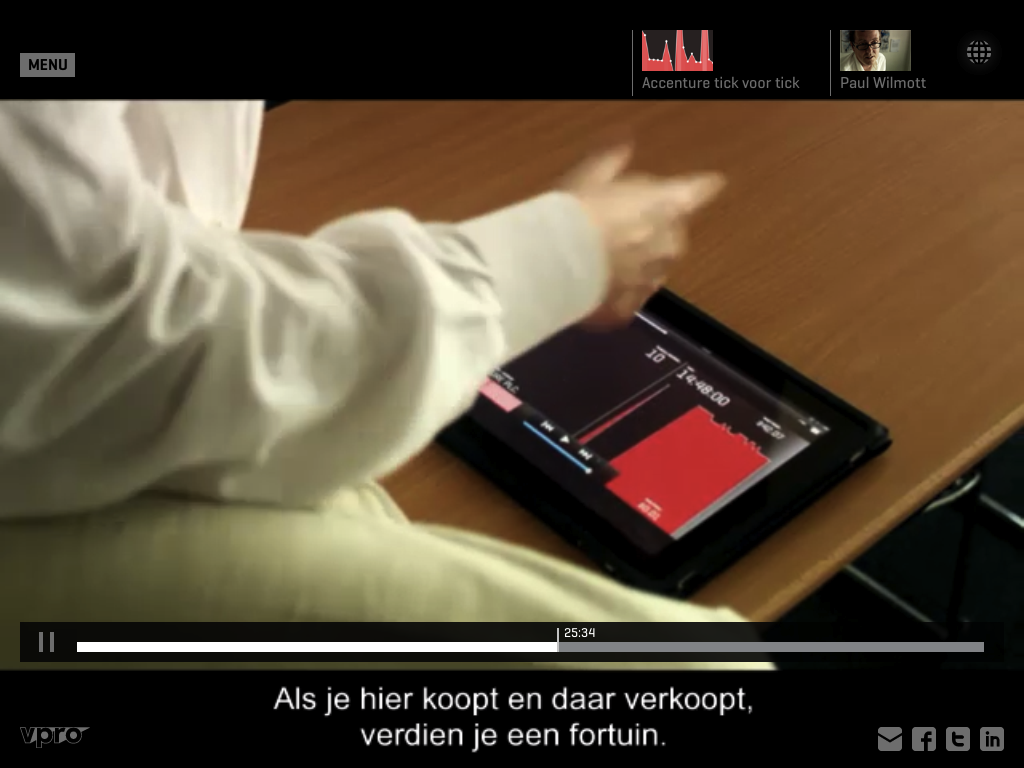
money & speed
The absence of noticeable delay makes this process work very well (it does not feel as an interruption of the flow at all even though the video itself stops). In the case of a couple of the bigger infographics there is an annoying delay before the infographics appear, but the transition back to the video is almost instantaneous.
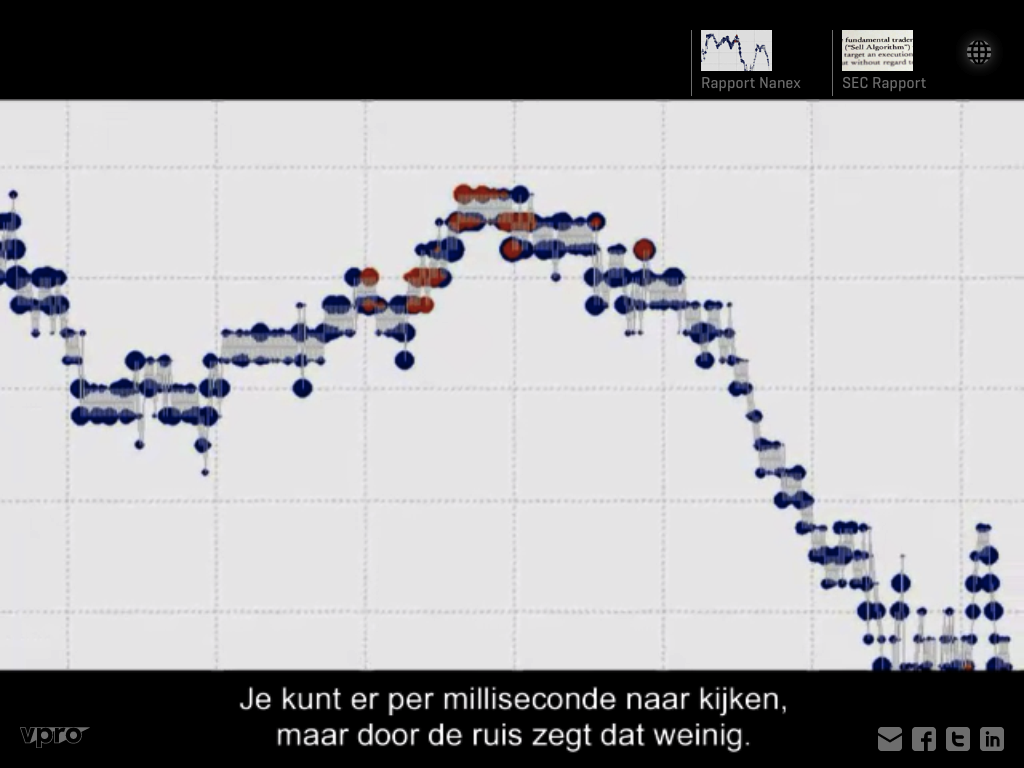
Unfortunately those big info graphics (tick for tick visualizations of three different stocks, a visualization of the fall of the dow jones index, a map showing possible locations for financial data processing centers in the vicinity of New York City, and a delayed real-time stock market data map) are not really connected to the storyline of the documentary.
These are clearly the most labor intensive parts of the ipad app, but they do not add to the understanding of the events described: The delayed real-time stock market data map is a complete waste of resources (although it has a vey nice darkish background noise that i am listening to right now) and the map of the data centers, while visually striking does not even show the locations of the data-centers that are depicted in the documentary. The tick for tick visualizations (visible on the ipad in the screenshot above) while impressive simply fail to convey much information (Alpher suggests that this is because ‘the information density is low’).
Given these shortcomings one might come to the conclusion that adding extra visualizations to a documentary like Money & Speed provides little extra value to the viewer. I am pretty sure that this is the wrong conclusion and that the real problem at hand is that the creators of ‘Money & Speed’ have simply selected the wrong data to visualize2:
money & speed
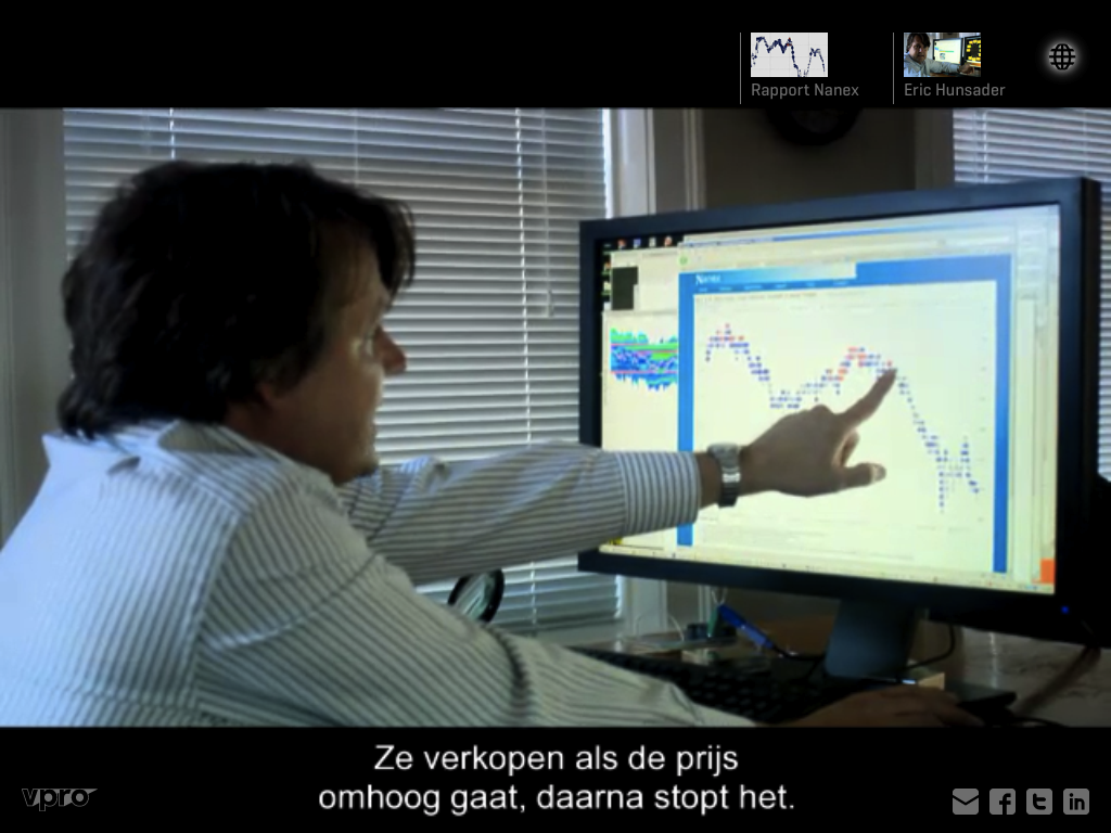
Towards the end of ‘Money & Speed’ Meerman juxtaposes two different views on what happened on the the 6th of May. That of the official SEC & CFTC report and that of independent data analysis done a by the Chicago based financial data services firm Nanex. Both identify different triggers for the flash crash and their disagreement seems to come from the granularity of time applied to their analysis. While the SEC & CFTC report works with seconds Nanex claims to be able to identify events on the nanosecond level that are averaged out (an thus invisible in the SEC & CFTC report) when looking at the events with less granularity. During this part of the movie Eric Hundsader is shown pointing at this data on one of his computer screens and if you ask me it is this crucial data-set that should have been included in the iPad app instead of the tick for tick visualizations:
money & speed
Still the ‘Money & Speed’ iPad app (the VPRO calls this format a ‘touchdoc’) shows a lot of promise. i can imagine that once the technology for integrating linear video content with additional assets like data visualizations becomes more common, attention will shift towards editorial concepts that better integrates the extra assets with the main narration. In an ideal case scenario that would mean that the underlying research assets of the creators are available to consumers both as extra information but also in order to independently verify claims made by the documentary makers. Given this ‘Money & Speed’ tastes like one possible future of investigative documentary film making.
-
At the time of writing the app is only available in dutch and only in the dutch app store. the VPRO is working on an english language version that will be available in other app-stores for a fee. It is free in the Netherlands because for regulatory reasons the VPRO cannot charge the public for content it has produced with public broadcasting money. This is not the case outside of the Netherlands and it will be very interesting to see how much income ‘Money & Speed’ will generate outside of the Netherlands. I could very well imagine that a documentary-app (is that an existing category?) of this quality could easily generate income that exceeds the production costs (of the app, not the entire project). ↩︎
-
Of course this might not have been entirely voluntary. It is possible that this is the only data that they were authorized to include or that they had to make choices which data to visualize really early in the project and as a result could not react anymore once the more interesting datasets appeared. ↩︎

